
From CSV MVP to €2.4M: designing and shipping a SEO marketplace from zero to exit

Where this starts
Co-founded Linkbroker. Joint CEO. Led design and operations, co-led product. 1,100 clients, 14 employees at exit, two and a half years – on top of earlier years at Backlinked. Both among Germany's leading SEO marketplaces.
I've been in the SEO marketplace space twice – first as a founding team member at Backlinked, then as co-founder and joint CEO of Linkbroker.
Linkbroker started almost by accident. My co-founder and I knew the SEO market from our Backlinked days and needed funding for a bigger idea. So we set up a simple link shop to generate cash – agencies could buy backlinks, we'd handle the fulfilment. It grew quicker than we expected into a productised service covering the full digital PR spectrum: guest posts, backlinks, brand mentions, press releases. The "quick side project" became a company – €2.4M annual revenue, 1,100 clients, and a team that grew to 14 by the time of my exit.
I spent around 70% of my time leading design and co-leading product – deciding with the team what to build, designing the interfaces, briefing developers, and watching how users actually interacted with what we shipped – through Microsoft Clarity recordings, support conversations, and internal data. The rest was process and operations. I ran fulfilment myself at first, built the SOPs, then trained and handed it to the team so I could focus on product. One of the workflows I built: incoming orders flowed into Asana, got enriched with AI-generated briefs, and triggered the next step automatically as tasks moved through the board. Less manual work for the team, faster turnaround for clients.
After two and a half years I sold my shares to my co-founders – we'd grown from two founders to five over the life of the company – and moved on. They brought me back as a freelance designer to redesign the product. This is what those years taught me about designing interfaces, websites, and conversion paths that actually convert.
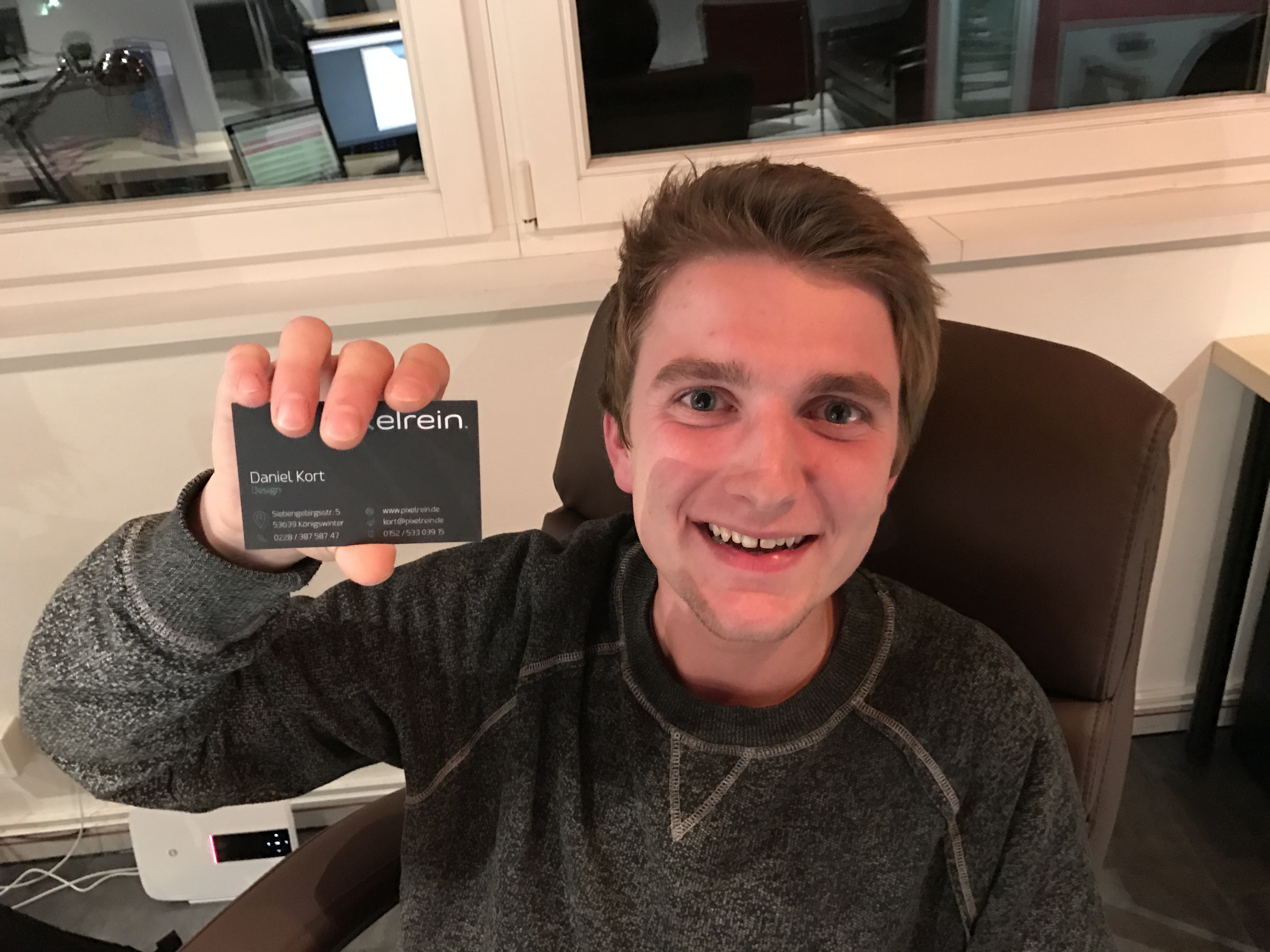
At our first Pixelrein office – the company behind Backlinked.
No UI, no problem: why the MVP shipped without an interface
The first version of Linkbroker wasn't really an app. We had a one-page website with a proper design – logo, copy, layout, the usual – but the "product" behind it was a single input field wired up to a spreadsheet.
You typed in a domain. The field queried a CSV in the backend. If we had the domain listed, the page returned a price. If you wanted to buy, you sent us an email. We processed the order manually. You paid via PayPal or bank transfer.
No checkout. No dashboard. No account system. No product catalogue. Just a search box, a CSV, an inbox, and a lot of manual work on our side. In startup terms it was closer to a concierge MVP than a software product – the front-end looked like a tool, but behind the scenes we were the tool.
As a designer, this was a deliberate choice – and one I still push for when clients are genuinely testing a new product or a new market hypothesis. The question we needed to answer wasn't "do people like the interface." It was "will agencies pay us for backlinks at these prices?" A beautiful app wouldn't have answered that faster. The search box did.
We priced the catalogue below the competition, on the assumption that if we undercut the market we'd get traffic and figure out the rest. First month: €6k in revenue. Third month: €20k. It worked quicker than we expected – though the mechanism itself wasn't a surprise. We knew the market.
The one thing I'd do differently: we spent too much time on the landing page. Illustrations, brand tone, visual polish – none of it mattered at that stage. We ended up renaming the whole company and redoing the branding six months later anyway. The MVP would have worked just fine with a template and Times New Roman.
Once orders started coming in, we moved fast to build the real app – I hired a developer early because the manual processing was eating all the time I needed to spend on product. We built module by module, each piece justified by demand we could already see: a catalogue first, then a cart, then checkout, then order tracking. (You can see one of the later iterations of that product in the Linkbroker dashboard redesign case study.)
The design lesson
The fastest way to validate a product isn't to design the product. It's to design the smallest possible test of whether anyone wants it. A CSV and a search box can outperform a polished prototype – because the goal of an MVP isn't experience, it's evidence.
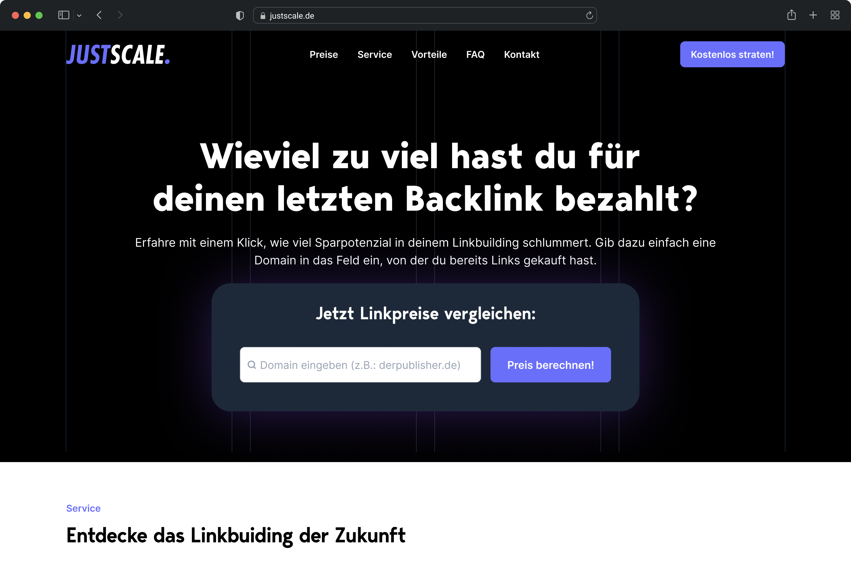
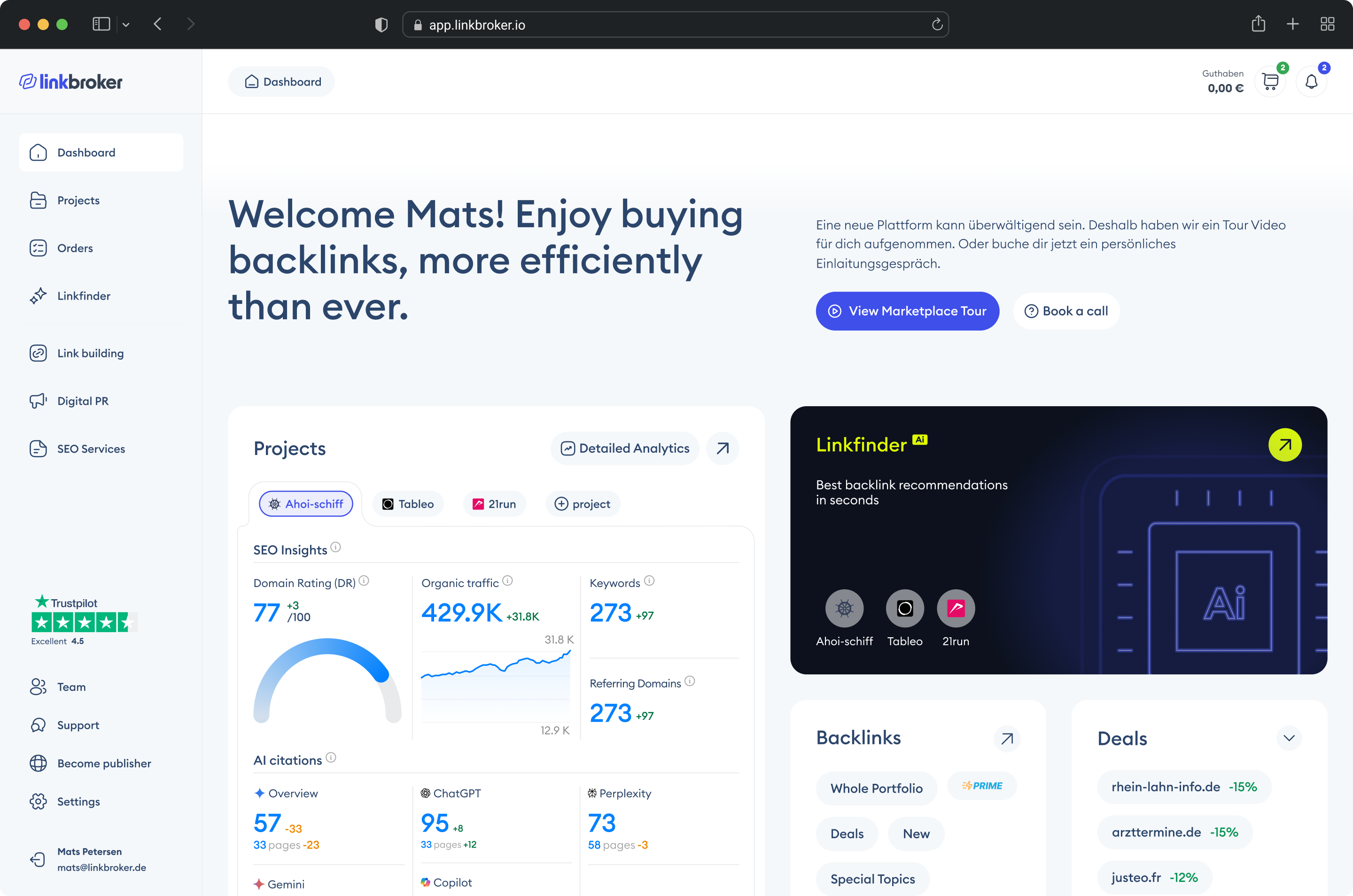
Left: the first version of Linkbroker – a one-page site with nothing but a search field "How much did you overpay for your last backlink?". Right: the dashboard I came back to redesign after the exit
How a pattern in the orders became a UX change that drove 23% of all sales
About a year in, I noticed something looking at our order history: customers rarely placed a second order before their first one arrived. They'd order once, wait for delivery, then order again. Not because we'd told them to – that's just how they used the platform.
The implication was obvious once I saw it. If we could shorten the gap between "first order arrives" and "second order placed," we'd compress the entire purchase cycle and lift monthly revenue without spending a cent more on marketing, ads, or new acquisition.
The behaviour had a natural shape to it. Our customers were mostly SEO agencies, and their workflow looked like this: place an order with us, wait for delivery, log in to retrieve the link, pass it on to their end client, then come back to order the next one. The login-to-approve step wasn't a trust problem – it was just how the job worked. But it meant the gap between delivery and next order was built into the sequence, and shortening delivery shortened everything downstream.
And shorter delivery is simply better for the customer. An agency that can deliver backlinks to their client in two or three days instead of seven looks faster, more reliable, and more competitive. Cutting delivery time in half isn't just a logistics improvement – it's a visible win customers get to show their own clients.
We couldn't make every supplier fast. And we didn't want to remove slow ones – they were real inventory, and sometimes a customer needed a specific niche domain that happened to be slow. But we could carve out a labelled, fast-delivery segment with a clear promise attached. Customers who prioritised speed could filter straight to Prime. Customers who needed something specific could still browse the full catalogue. The two didn't compete – they served different needs.
There were four ways to approach it: scout faster suppliers, speed up our own fulfilment, show fast-delivery options more prominently, or carve out a fast-delivery segment with its own UX and a promise attached. We worked on the first two in parallel – they were the right long-term moves – but the fourth was the quickest to ship and the biggest lever on revenue.
The algorithm
Any publisher who delivered three or more orders in under two days automatically got pulled into a "Prime" bucket. Prime promised three-day delivery, which gave us a one-day buffer against the two-day threshold. No manual curation, no supplier negotiations. The system watched the data and promoted products into Prime as the evidence accumulated. More orders meant more data, which meant more products qualifying over time. The catalogue grew itself.
The UX
I deliberately borrowed the pattern from Amazon – the same concept, the same name, a similar visual signal. A badge on Prime products in the main table. A dedicated Prime tab for users who wanted to filter straight to fast delivery. No user education needed. Anyone who'd ever bought anything on Amazon already knew what Prime meant – so pretty much everyone. The cognitive load of the new feature was close to zero.
Design and shipping took about a week.
The result
After two months, 23% of all sales were coming through Prime. It's worth being honest about the number – fast-delivery suppliers tended to be the bigger, better publishers anyway, so some of that 23% would have happened regardless. But the concentration, the branding, and the UX shift moved real volume. Repeat-order frequency went up. Conversion rates on Prime items were higher than non-Prime. Starting with 250 Prime products, the catalogue grew to 1,800 out of 50,000 as the algorithm kept promoting new qualifying products.
The design lesson
The product you need to build is often hiding in your own order data. Sometimes the win isn't a new feature or a fixed problem – it's creating a labelled segment of what you already have, with a commitment attached. Those Prime products would have delivered at the same speed without the badge. What moved revenue wasn't faster delivery; it was making speed visible and filterable, so customers who cared about it could route there directly. The UX that sells it doesn't need to be novel, either – borrowing a pattern users already understand means the feature works on the first click, without a tooltip.
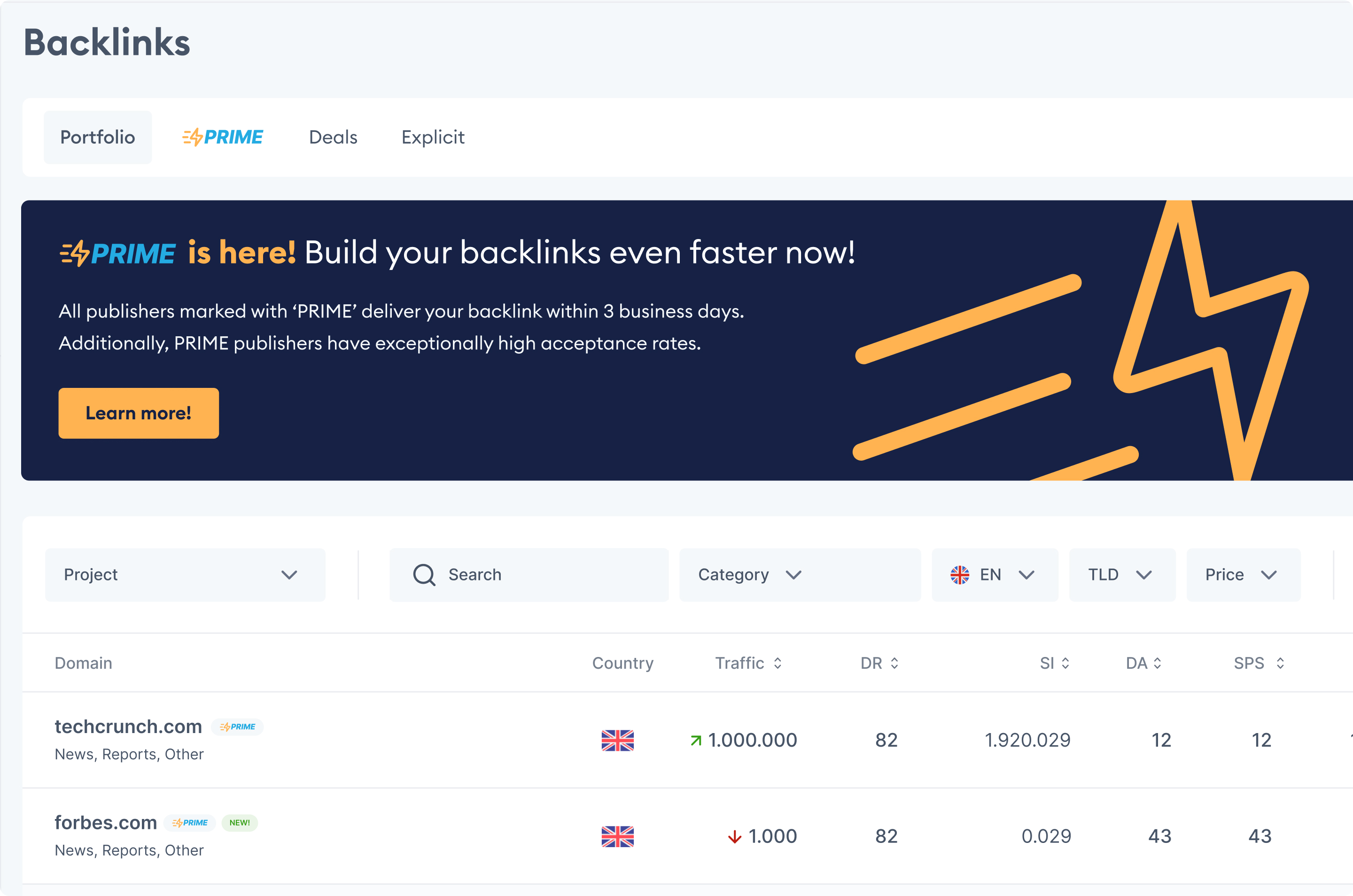
The Prime tab and announcement banner inside the Linkbroker app
The pricing system that lifted margins 17% – and the operational problem it exposed
About a year and a half in, I noticed something uncomfortable in the bank account. We'd hired more people and our cash position was sliding instead of growing. We were supposed to be making money. The numbers said we weren't.
So I did what I always do when something doesn't add up: I went hands-on. I took 100 orders and processed them myself, manually, end to end – the same way our fulfilment team did them every day. I inquired with suppliers, negotiated, recalculated the margin on each order by hand. The discrepancy between what our system said we were earning and what was actually landing in the bank was real.
Two things came out of that exercise.
First, the pricing was wrong
We'd set prices once during early growth and barely revisited them. Meanwhile our cost base had bloated – more people, more software, more rent, more overhead per order – and the market prices themselves had shifted. Our selling prices needed to be higher across the board, and our buying prices needed to be re-checked against current rates. The margins on paper weren't the margins we were actually earning.
Second, the team was underperforming
Doing the orders myself, I was getting better prices from suppliers and faster publishing turnaround than the team was achieving on the same products. That wasn't a pricing problem – it was a process and skill problem. I held a meeting, walked the team through what I'd found, adjusted the SOPs, and retrained on supplier negotiation.
The pricing system itself
I built a process to keep our pricing aligned with the market on a monthly cadence rather than relying on prices we'd set and forgotten. New products coming into the catalogue were priced automatically by the same system instead of someone having to research and set each one manually. The team stopped having to manually check and adjust prices product by product. The system handled the routine work; humans handled the exceptions.
The result
Combined with the SOP changes and the renegotiated supplier prices, it delivered roughly 17% margin improvement once everything was in place.
The design lesson
The same instinct that fixed our pricing fixes most marketing sites. When something isn't converting, the answer isn't to guess at hero headline variations and hope traffic sorts it out – that's optimising on assumptions. The answer is to watch what users are actually doing and ask them directly what they're thinking: 10–20 session recordings on the pages that matter, 2–3 conversations with recent customers to hear how they describe the problem in their own words, support tickets and sales calls for the language users use, GA4 funnels to see where they drop off. Once you've seen the actual behaviour, the design changes become obvious – because they're responding to real evidence, not guesses dressed up as data. That's what the audit phase of my engagements is for, and why it always comes before any redesign work.
The numbers behind the decisions
Every section in this case study is built around a real outcome – not assumptions, not aesthetics, but measurable shifts in how the business performed.
Of sales from one UX change
Margin improvement
Annual revenue at exit
What I'd do differently – and how it shapes the work I do now
Looking back, the biggest thing I'd change isn't a design decision. It's a measurement one.
We had product analytics. We had financial reports. But the systems were built reactively, after we needed them, instead of early enough to matter. By the time I noticed the margin problem, we'd already burned cash. By the time we had proper dashboards, the team was making decisions based on what they remembered rather than what the data said. If I started another company tomorrow, the first thing I'd build once money started coming in – before the team, before the brand, before the second product – would be the tracking infrastructure. Financial monitoring, lead attribution, conversion events, the full picture. Not because data answers every question, but because flying blind makes the answerable questions harder than they need to be.
A second thing I'd change: more discovery before building. We shipped a lot of things that customers asked for that nobody actually used – the pattern repeated more than once. The Mom Test approach – asking about past behaviour rather than future intentions – would have saved us months of building things into a void. Customer requests aren't the same as customer demand. You learn that the expensive way once. After that, you validate first.
The related lesson: quantitative data and qualitative data aren't interchangeable, and most teams lean way too hard on the first.
Metrics tell you what people are doing. Conversations tell you why.
GA4 can tell you 60% of visitors drop off at pricing. Only a customer can tell you they dropped off because your lowest tier felt too expensive for what was promised. The "what" without the "why" leads to optimising the wrong thing – moving buttons, rewriting headlines, testing colours, while the real issue sits somewhere nobody bothered to ask about. Qualitative data is harder to collect, which is why most teams skip it. It's also where most of the answers are.
This is the thinking behind almost every part of how I work now. There's a phrase for it – Claude Hopkins called it "scientific advertising" in 1923: treat every decision as a testable hypothesis, measure what happens, let evidence decide. The same principle applies to web design. Aesthetic and evidence both matter; evidence decides which aesthetic choices earn their place.
That philosophy shapes the specific services in my offer.
The customer voice synthesis comes directly from learning that buyers' actual language matters more than what founders think their buyers care about. The GA4 and Microsoft Clarity setup comes from knowing what flying blind costs. The site audit and SEO category teardown come from understanding that you can't design in isolation – every page, every SEO strategy, every ad lives in a competitive context, and being intentional about that context is half the work. The optimisation cycles come from learning that nothing ships finished – you launch, watch, and iterate, or you're guessing. The direct Slack access exists because I've worked with freelancers who took days to reply, and I know how that feels from the client side when something is on fire.
The pre-launch conversion audit and customer voice synthesis are the most direct lessons from Linkbroker: do the smallest possible test of whether something will work before committing to the full project. Gather the evidence that the problem you're about to solve is the actual problem. If shipping the highest-leverage fixes in week one doesn't move anything, that's a signal worth taking seriously before spending another seven weeks on a redesign.
I sold my share in Linkbroker because the company had stopped growing in a direction I wanted to lead. The experience clarified something I'm still acting on: I like building. I like going to market. I like designing systems that make a business work better. The conversion studio I'm building now is a way to keep doing that – this time without the overhead of running a company, and with the lessons of running one fresh enough to actually apply.
"... His client focus was outstanding: he identified problems directly, developed innovative solutions, and incorporated feedback into further development ..."

Working with me
If you're a founder of an SEO SaaS or SEO agency – post-MVP, with 2,000+ monthly visitors and a marketing site that hasn't kept up with the product – there's probably a conversation worth having.
I only take projects where I think I can hit the 15% conversion target. I use the first two weeks to verify the assumption – through the audit phase and conversations with your customers – and if the numbers or market don't support it, I'll tell you then rather than take the project.
Every engagement starts with a 14-day trial. If it's not working by the end of it, you walk away free. After that, you're covered by a 60-day performance guarantee – if we don't hit the target, I keep working at no extra cost until we do.
The work starts with figuring out what's actually getting in the way of more signups – not assumptions, real evidence – and then redesigning around that.
See how the engagement works →

Want to work together?
If your marketing site isn't converting the way your product deserves, here's how the engagement is structured.