
Giving Germany's top SEO marketplace the interface it deserved
The problem
Not user centric
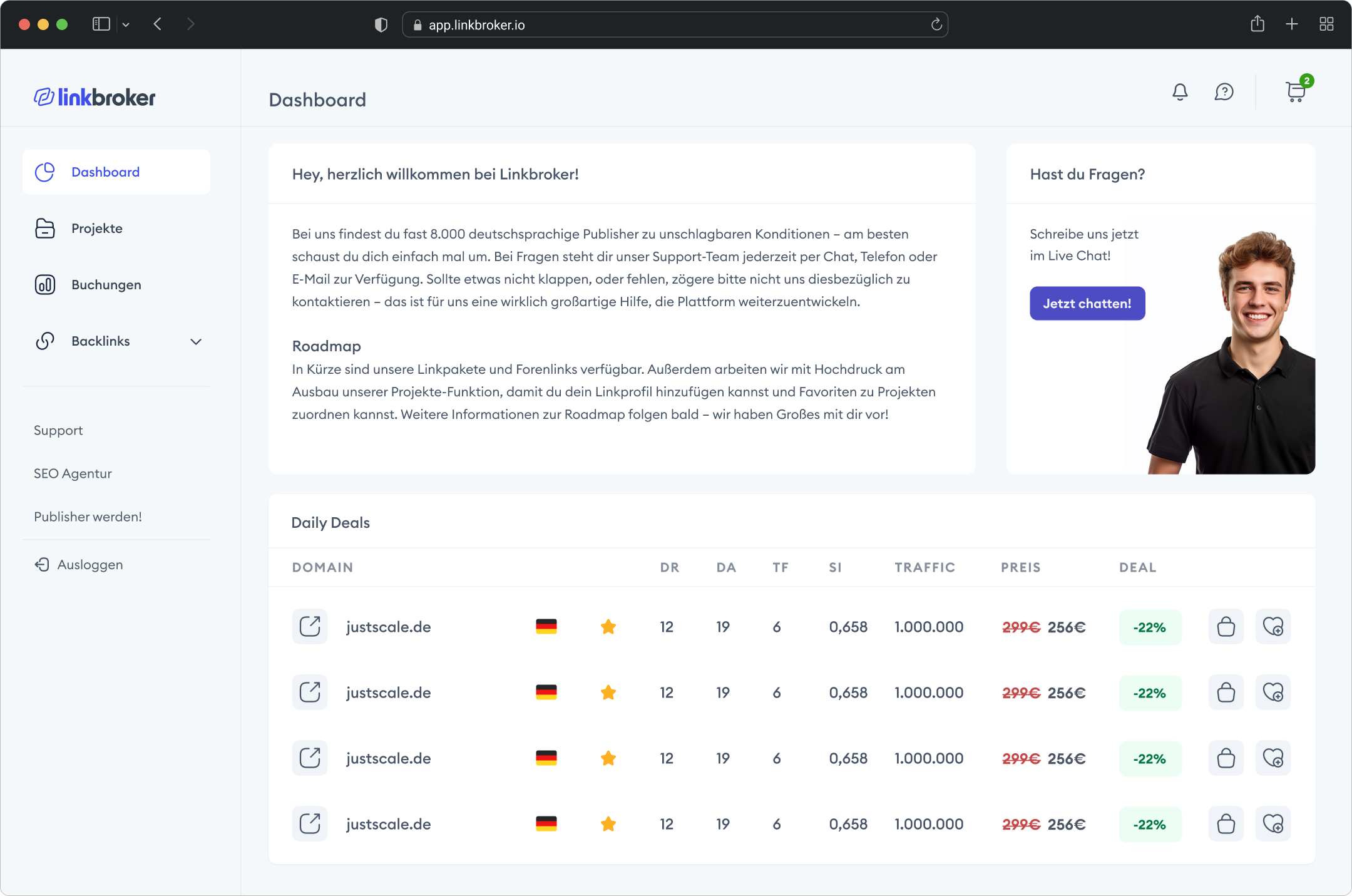
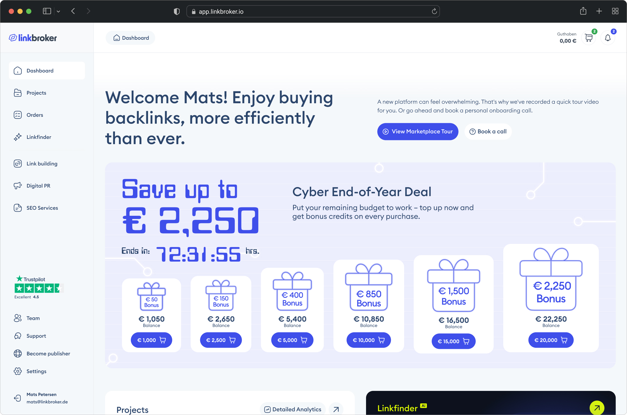
LinkBroker's dashboard hadn't changed since launch. It was the first screen every user saw, every day – and it gave them nothing. A static welcome message, a stock photo support card, and a Daily Deals table below the fold. No dynamic content, no personalisation, nothing that changed between visits. For a screen with that much daily traffic, it was completely wasted – and what was there was sales-oriented rather than user-centric.
Missing project metrics, missing order tracking, missing task management. Users had no way of knowing the status of their orders, whether something needed their attention, or how their link-building campaigns were performing – not without leaving the dashboard and navigating to separate pages or even tools.
The typographic hierarchy was flat – headings and body text competed at similar sizes, making it impossible to scan and find what mattered first. No interactive elements, no quick actions, no clear entry points into the platform's core features.
On the data side, there were no heatmaps or session recordings in place, and while Google Analytics was installed, no events were set up. Zero visibility into how users were actually interacting with the dashboard – which features were used, where users were dropping off, or what got ignored entirely.
Pre-Redesign Dashboard
The Process
Research / Discovery
Three years of embedded work with LinkBroker meant the discovery phase wasn't about learning the company – I already knew the business model, the customers, the brand voice, and how the team made decisions. The work was auditing the gap between what the dashboard was and what users needed.
That gap was obvious: the dashboard sat on prime real estate – the first screen every user saw, every day – and used it as a static page to talk at users instead of working for them. I pulled Mats, the other stakeholders, and the support team into conversations about what users asked for, complained about, and got stuck on. The team had the answers; no one had sat down to collect them in one place.
Tracking didn't give us much to go on, so I looked outward. I audited 20 dashboards across the category – direct competitors like Whitepress, Backlinked, Bazoom, SEO Galaxy and many others along with a broader scan of adjacent SaaS and e-commerce dashboards for patterns worth borrowing. The bar was low. Most weren't interactive in any meaningful sense: a list of recent orders you couldn't click into, a news feed about the marketplace, an account balance. Screens you looked at, not screens you worked in. Only one – Bazoom – had built out proper analytics, which caught me off guard and became a useful reference for what was possible in the category.
The scan confirmed the diagnosis. I stopped when new logins stopped surfacing anything I hadn't already seen.
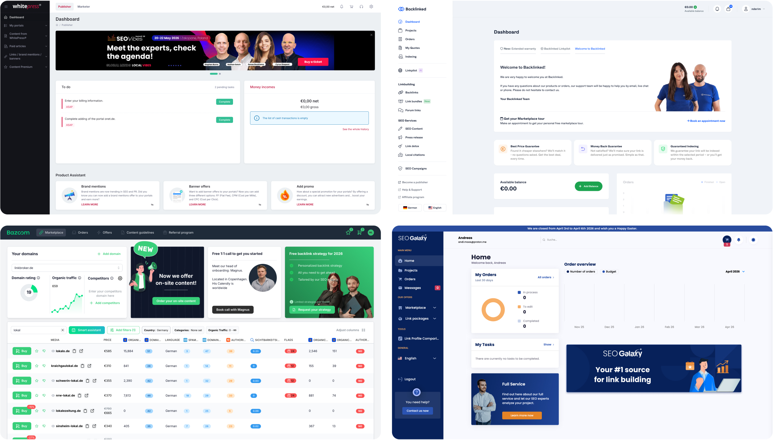
SEO marketplaces, left to right: Whitepress, Backlinked, Bazoom, SEO Galaxy
Moodboarding
The brand system had already locked in colour, typography, and the core component styles. What it hadn't defined yet was everything a dashboard actually needs – card layouts, gradient treatments, progress indicators for orders, dropdown patterns that made sense for the data we were showing, affordances to make clickable tiles feel clickable, and the structure of a to-do feed. So the moodboard was targeted: not a general mood-fishing exercise, but a deliberate hunt for references the existing system didn't yet have answers for.
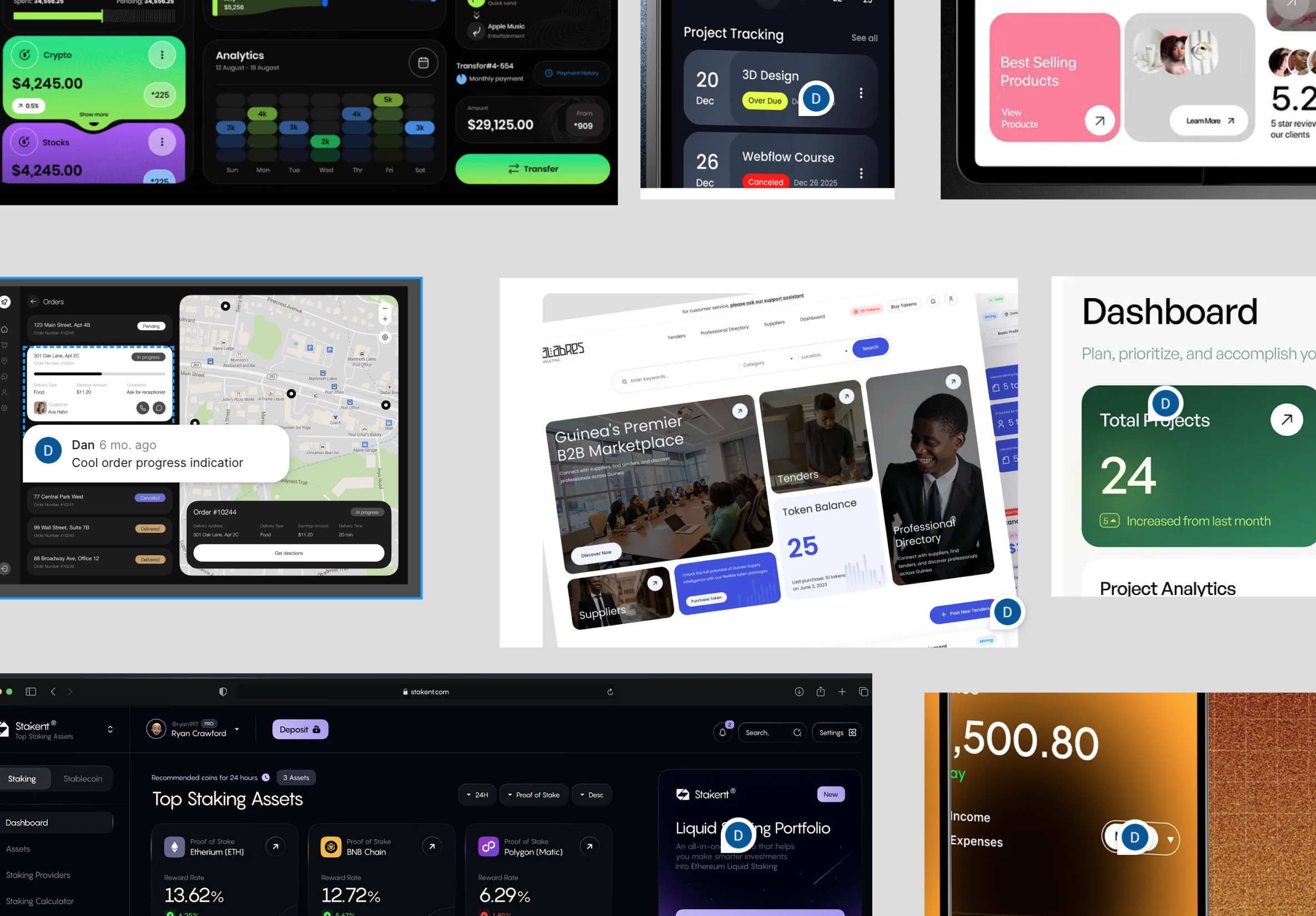
Part of the moodboard
I pulled most of the references from Dribbble and Mobbin, across dashboards from other categories where the component problems I was solving had already been worked out. Mats reviewed the board, confirmed the direction, and we moved on.
Information Architecture
Before opening Figma, I mapped every dashboard block in a Google Doc – what it should contain, why it exists, and the layer of functionality we'd build on top of it. Working in a document instead of a design file is faster to iterate on, easier to share, and – more importantly – keeps the conversation about what the dashboard should contain, not what it should look like. That's the decision that determines whether users can do their job, and it's the easiest one to get wrong once anything on screen starts looking finished.

First ideation of possible content of the dashboard
The table below is the document I shared with Mats. Each block has a purpose, a content definition, and an extension ideas column – a second layer of functionality the block could grow into over time. These started out as genuinely speculative: things to aim for later, not commitments for this build. But during execution a handful of them turned out to be easier to implement than we'd expected, so they got pulled into scope. Most of what's in that column ended up shipping in one form or another.
Once Mats signed off on the blocks, I moved into a rough layout pass – weight, balance, order of elements. The diagram below was a first sketch: a way to stress-test the hierarchy before committing any of it to design. As usually happens, the final structure ended up looking quite different. Some blocks got more weight than the sketch suggested, others less, and a few moved entirely. That's the point of working at this fidelity – cheap to change, cheap to throw away.

Diagram of the dashboard (first sketch)
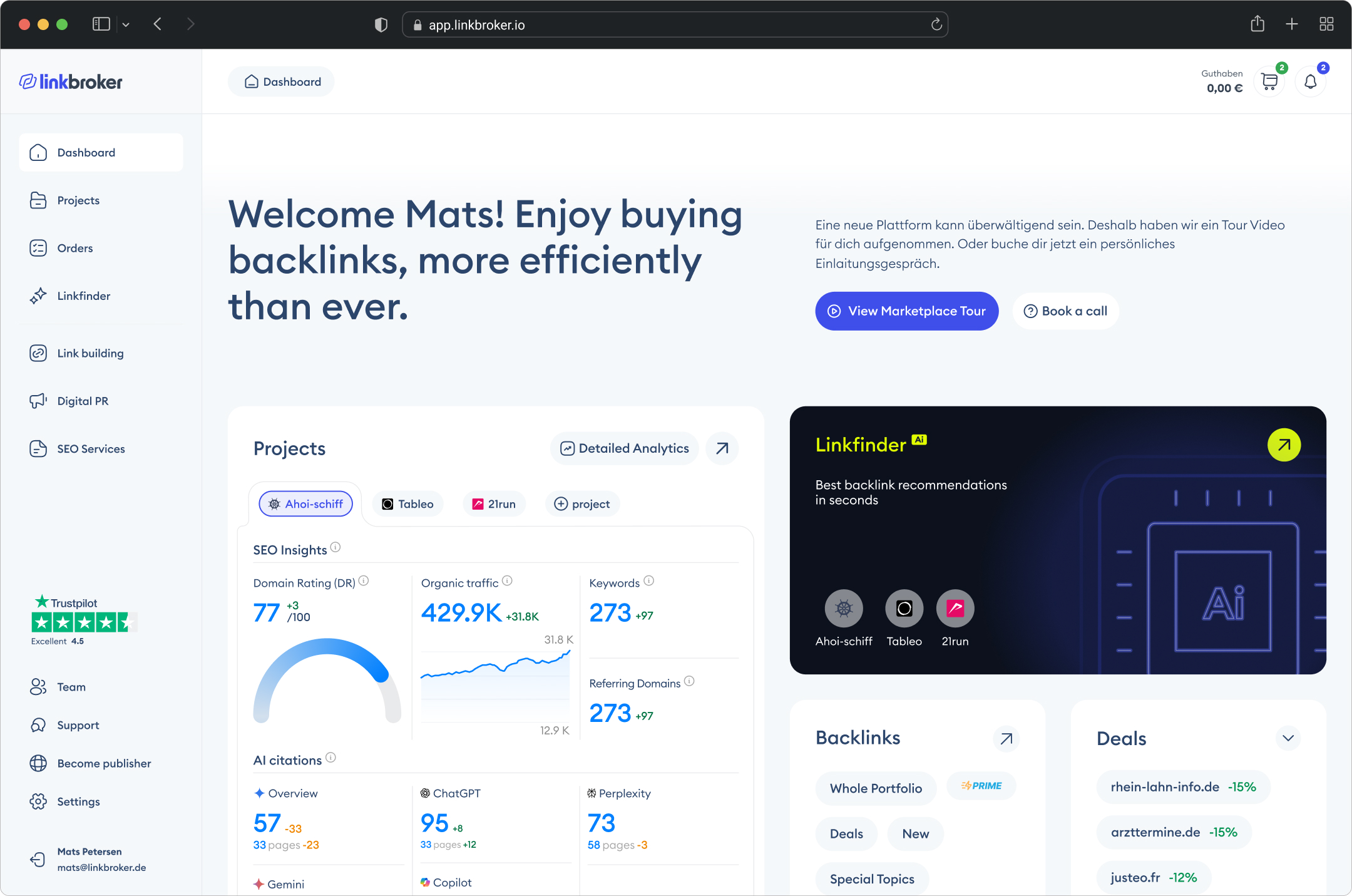
From there I moved into above-the-fold explorations. I'd planned to show two directions. Mats asked for a third. I ended up exploring three formally – but something about all three was off. The top-right felt empty, the balance was wrong, and the hero area was fighting with the blocks below it instead of working with them. So I kept going, and a fourth option came out of that – a looser version I'd been pulling at in the background. That fourth one was the first version where the above-the-fold actually felt settled: the hero, the projects block, and the Linkfinder teaser stopped competing and started working as a single story. It's the one we shipped.
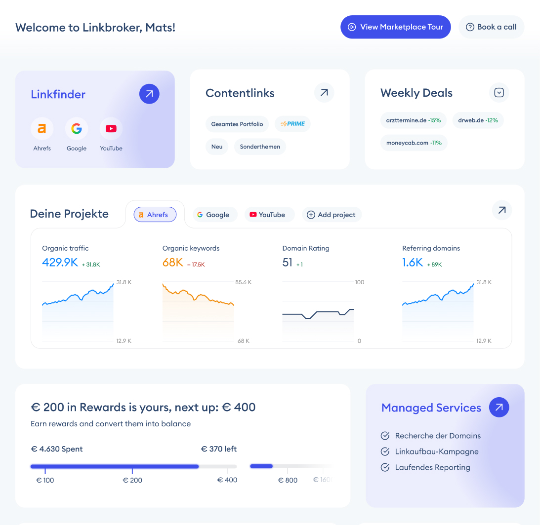
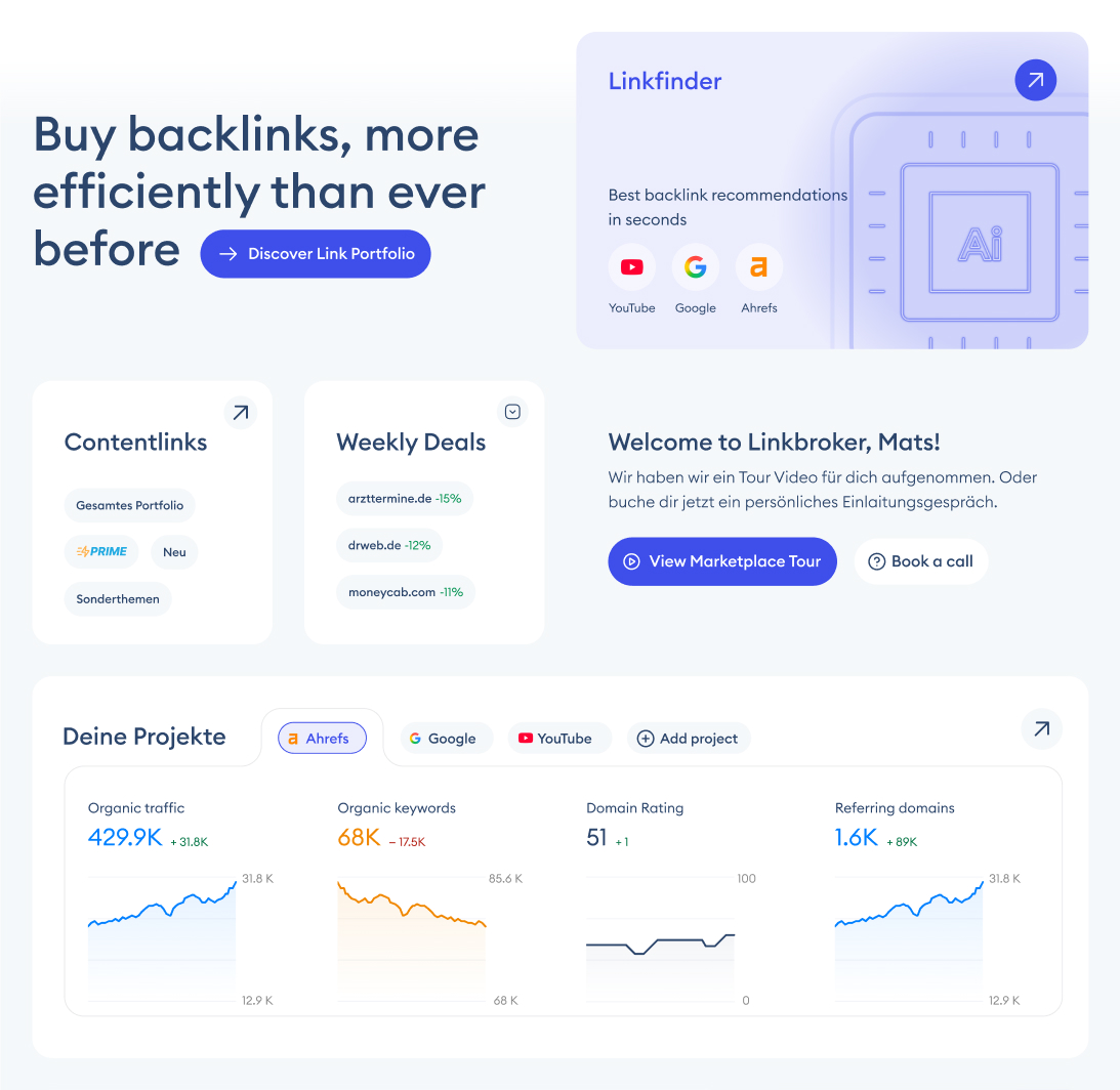

Exploration of three above-the-fold options
The three below are the formal explorations. The version you'll see in The Solution is the fourth.
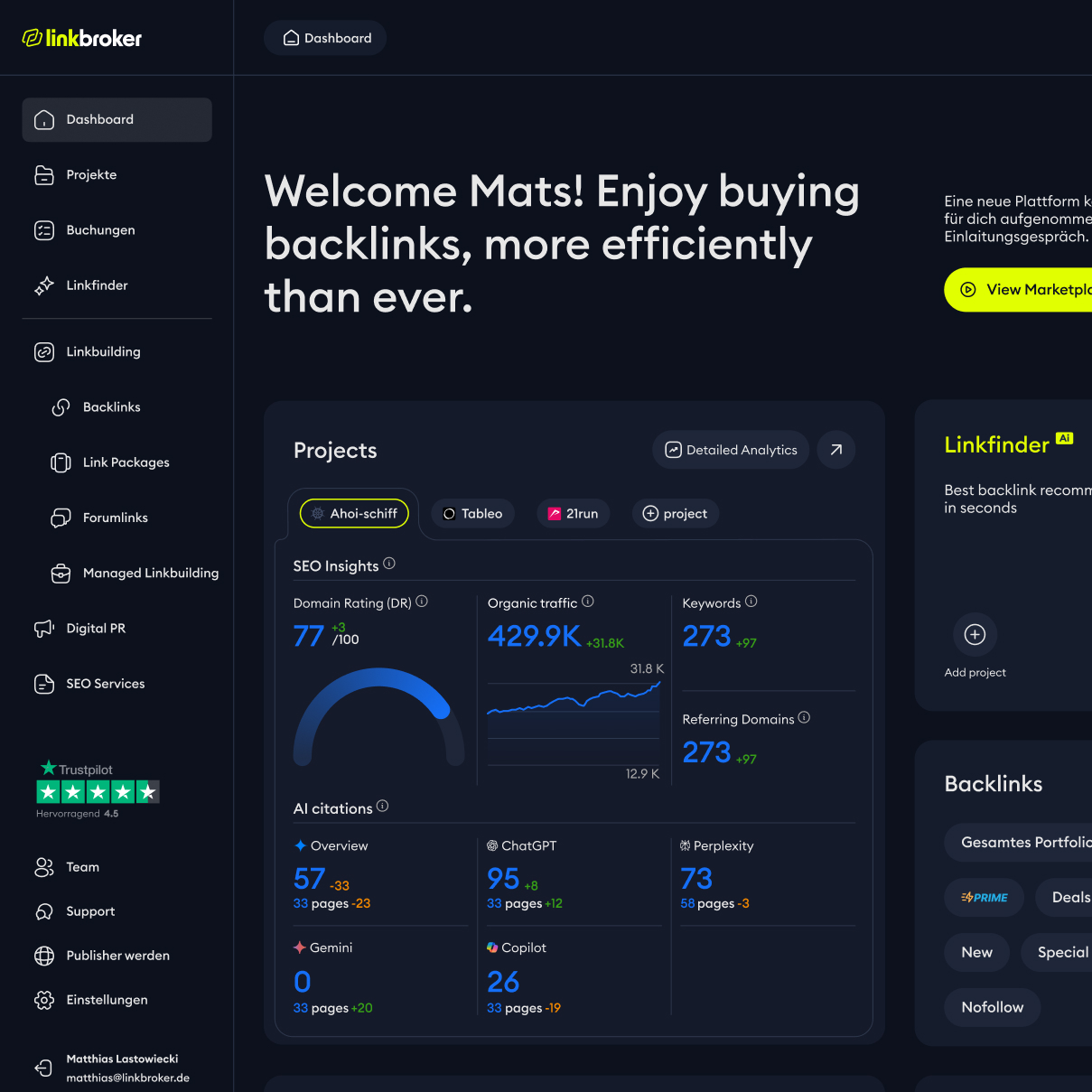
The Solution
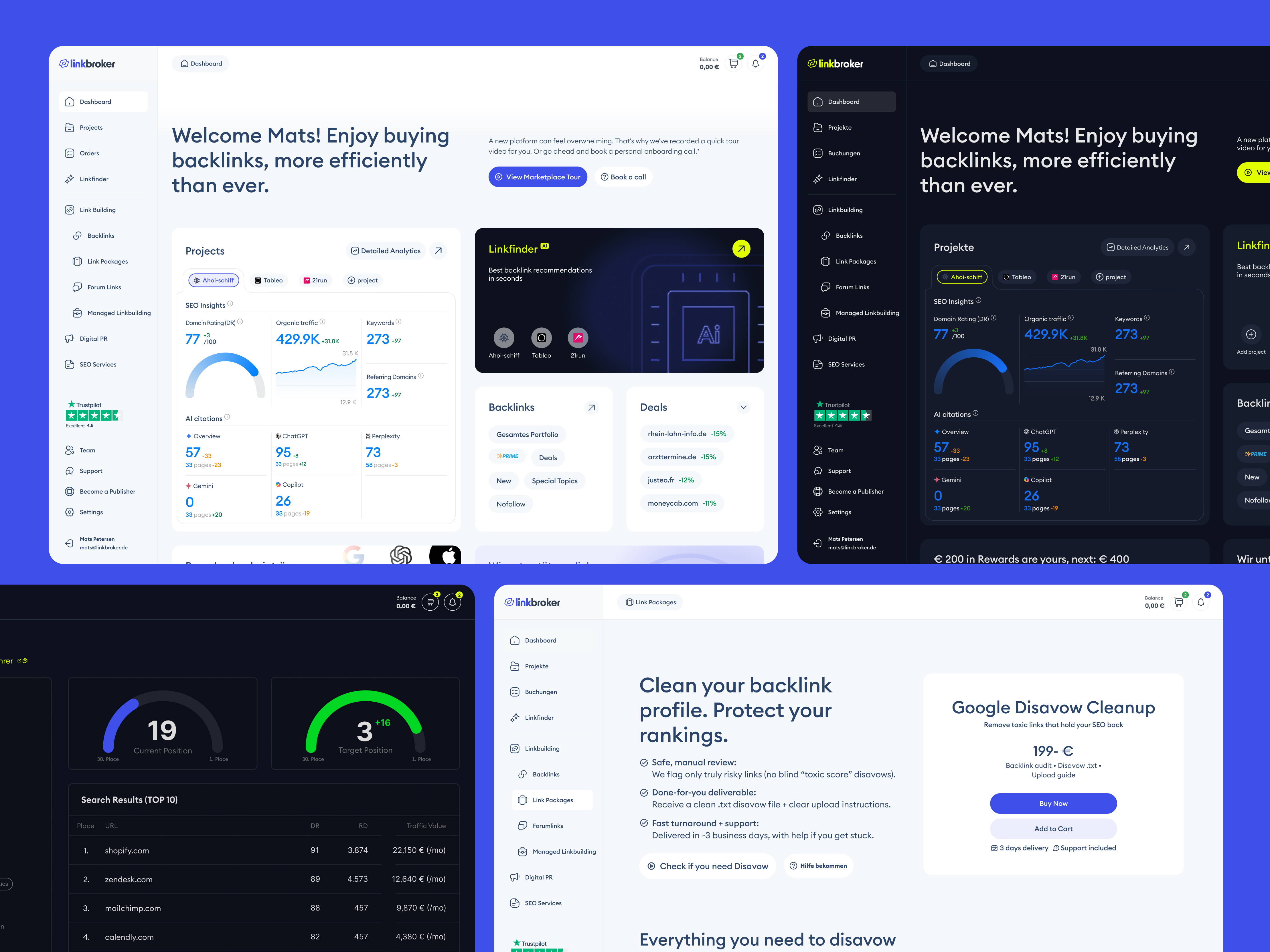
New dashboard
The new dashboard does something the old one didn't: it earns its place on the screen. Instead of a welcome page with a Daily Deals table, it gives users real-time SEO analytics across their projects, order progress they can actually track, a to-do list tied to real tasks, and quick access to the core products of the marketplace. Most of what's on this screen would cost money to get elsewhere – the kind of keyword, domain, and traffic data you'd normally pay an Ahrefs or Semrush subscription for. Here it's just the landing page.
There are actually two versions. The main user groups are different enough to need them: in-house entrepreneurs running SEO for their own business, and agencies running it for multiple clients. The entrepreneur version leads with a Product Spotlight tile – a single, easily swappable slot Linkbroker can use to surface whichever product or feature they're pushing at the time. The agency version replaces that tile with a Cashback module – volume agencies spend more, and Cashback turns that behaviour into a visible, gamified reward. Same underlying dashboard, two different above-the-fold priorities, matched to how each user group actually works.
The decision I'm most happy with isn't any single element – it's the balance. A marketplace dashboard could easily turn into a billboard: every tile an upsell, every block a CTA. This one doesn't. Most of the real estate goes to things that help users do their job – analytics, orders, tasks, quick actions, learning content. The promotional blocks are there, but they're proportional, and sit alongside tools that pay rent. For a platform that makes money when users spend, that restraint is a choice. I think it's a generous one.
Final version
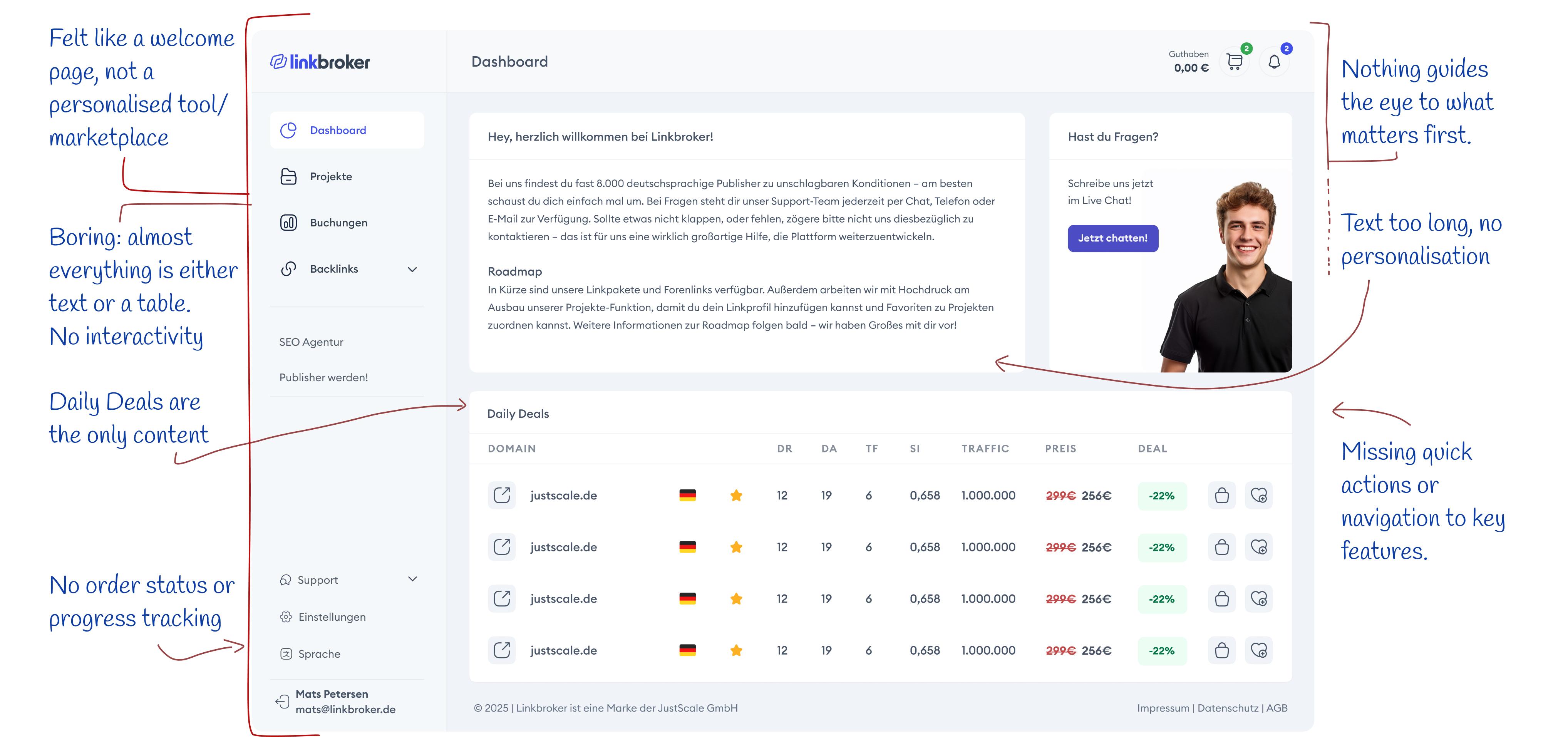
A closer look
The annotated version below calls out the decisions that mattered most. Some are structural – the personalised welcome, the Linkfinder teaser as the visual anchor, the integrated social proof. Others are about what replaced what – the built-in announcement bar took over from a third-party add-on, and the order tracking gave users visibility they previously had to leave the dashboard for. Each annotation is a small decision. Together they're the difference between a welcome screen and a working tool.
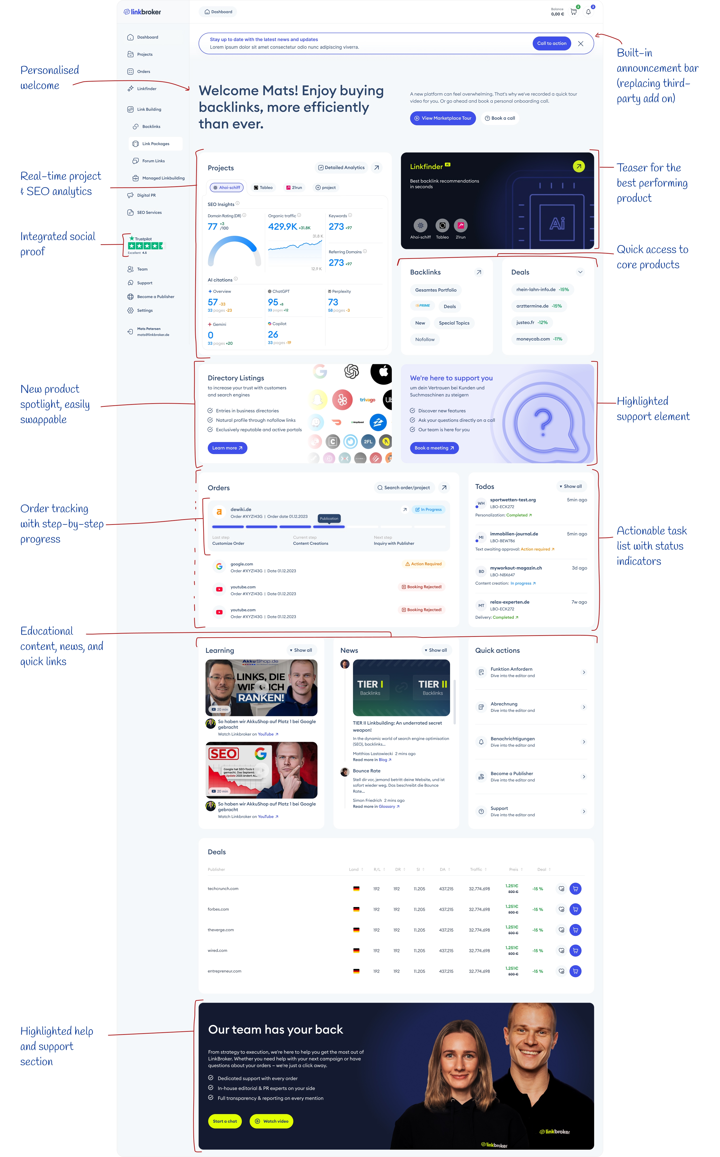
Redesigned Dashboard
Before and After
Putting both designs side by side, the shift is mostly about hierarchy. The old dashboard had almost no typographic scale – headings and body text sat at similar sizes, so nothing pulled the eye. The new one uses size, weight, and contrast deliberately, with a proper grid and vertical rhythm underneath. The result is scannable in a way the old one wasn't.
The first thing you notice when you land on the new dashboard – after the welcome headline – is the Linkfinder tile. It's the only dark element on a light screen, sitting in the top right, and it jumps at you before anything else. That's on purpose: Linkfinder is the highest-value feature on the marketplace, so I made it the heaviest thing in the visual field. Second priority is the Projects block – big tile, detailed analytics graphs, the only place on the screen where that kind of data shows up. Between those two, the user's first five seconds on the page are spent on the two things that actually matter: the tool that makes the marketplace worth using, and the numbers that tell them whether it's working.

Comparison: previous (left) vs. new design (right)
Different versions
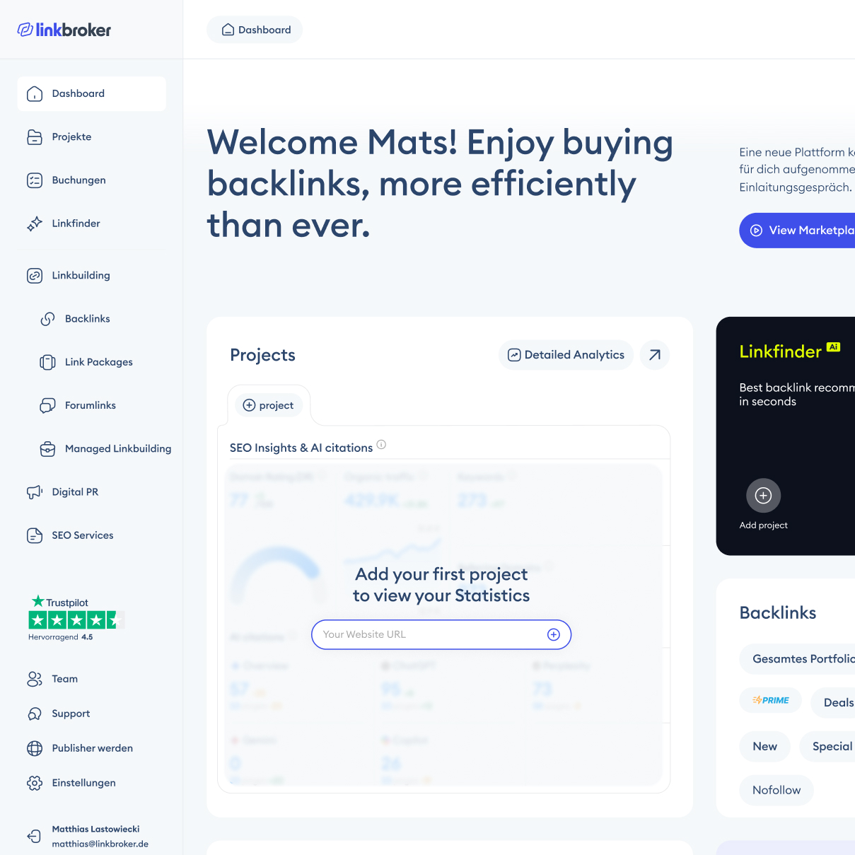
A part of design that's often underestimated is what a product looks like to someone using it for the first time. Empty states are usually treated as an afterthought – a grey message saying "no data yet" and nothing else. I wanted these to actually help.
The dashboard has a blurred version of each element underneath an overlay, so first-time users can see what the finished state will look like once they've used the product. But the overlay isn't just a message – it contains a shortcut. The Projects empty state has an input field where you can drop in a website URL and kick off a new project directly from the dashboard, without navigating to the Projects page and adding one there. The Orders empty state doesn't just say "no orders yet" – it surfaces quick-action buttons to the products you're most likely to want. The idea is simple: show users what's possible, and give them the fastest route to getting there.
Other Product pages
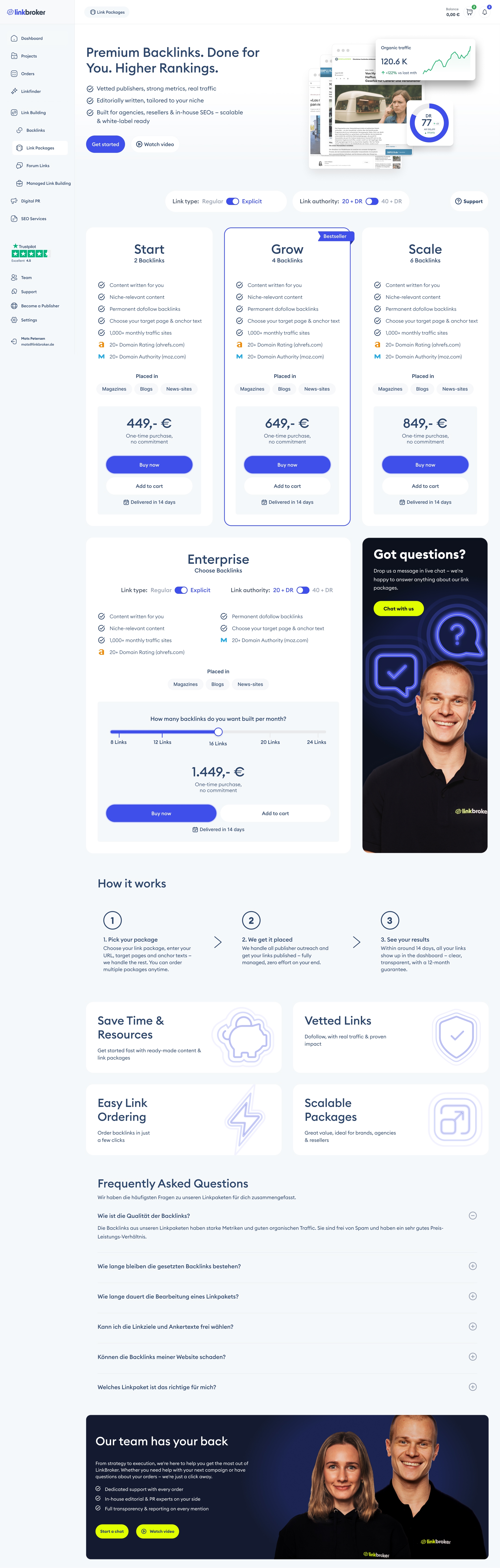
The case study focuses on the dashboard, but I also redesigned the product pages across the marketplace. Linkbroker sells in three tiers: backlinks as the primary product, then secondary products like forum links, brand mentions, link packages, managed link building and digital PR, then tertiary products like Google Disavow Cleanup. Each tier has a different job, so each got a different treatment.
The example below is the Link Packages page – a secondary product. Linkbroker originally sold backlinks in three packages: Start, Grow, and Scale. I added a fourth, Enterprise, as a build-your-own tier. Some buyers want a fixed package; others want the flexibility to set their own volume and authority. The existing structure didn't serve the second group, so Enterprise fills the gap: a slider for package size, toggles for link type and authority, and a dynamic price that updates as the user configures the order.
Because Enterprise needs more space than a fixed-price card, it couldn't sit in the same row as Start, Grow, and Scale. I gave it its own row, paired with the "Got questions?" tile. That solved two problems at once: Enterprise got the prominence it deserved, and a four-card row – which tends to look cramped – became a cleaner three-plus-one layout. Throughout the page, the design surfaces help in multiple forms: a tutorial video, a live chat button, a strategy call booking. Agencies buying link packages don't always know what they actually need, and making it easy to ask is part of how the page sells.
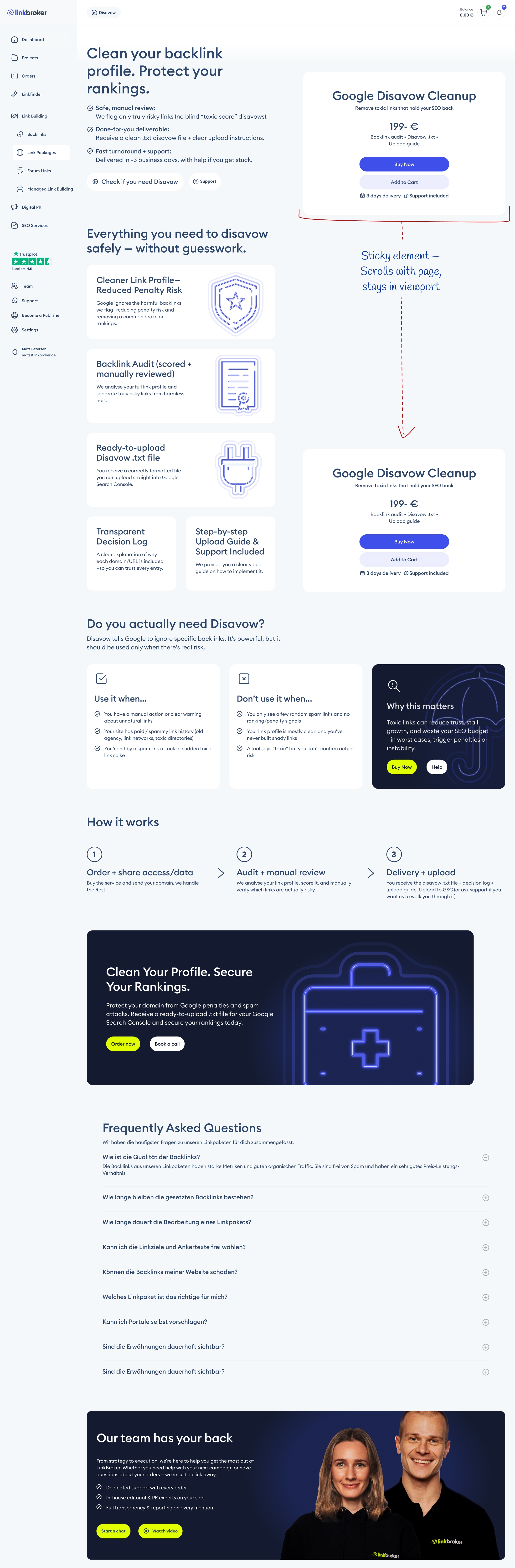
The next example is Google Disavow Cleanup – a tertiary product. These are specialist services most buyers have never used, don't fully understand, and need explanation before they'll consider buying. Before the redesign, Disavow was buried – under-explained, hard to find, and not selling well. I gave it a proper commercial page.
The layout splits into two halves. The left is slim and informational – what Disavow is, when to use it, when not to use it, how the process works. Keeping the explanation column narrow makes it scannable instead of wall-of-text. The right is a sticky buy box, so once a buyer decides they want it, the purchase button is already in their viewport – no scrolling back up. The pattern is borrowed from e-commerce product pages, and it works for the same reason: reading and buying are two different mental modes, and a good page lets the user switch between them without friction.
Advertising Email design
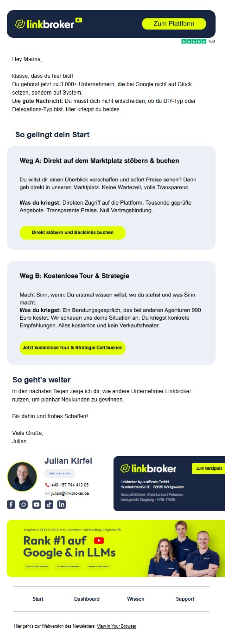
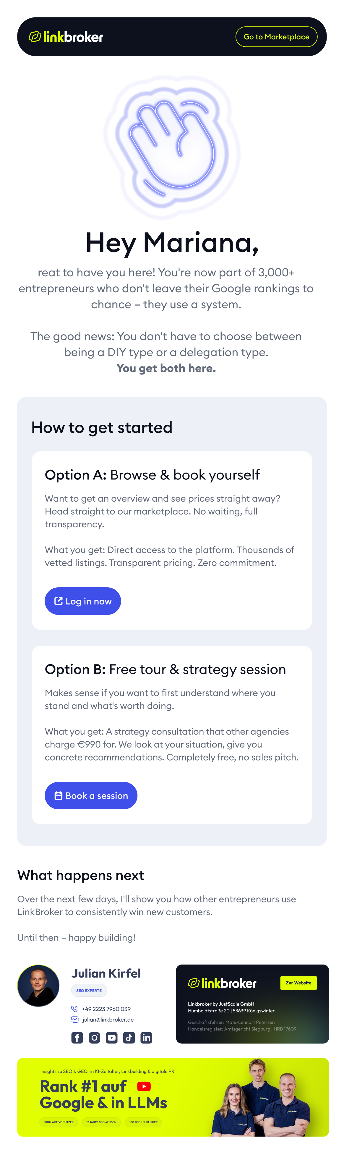
The email redesign wasn't in the original scope. Linkbroker showed me what another designer had produced, I offered to do a version of it, and this is what came out. Same message, different execution.
The old email had two problems. First, it opened with body copy – no image, no visual hook, nothing to pull the reader in before the text started working. Second, the "How to get started" section was two floating boxes that didn't read as a pair: Option A and Option B sat in the email as separate things the reader had to mentally connect.
The new version leads with an image and a large heading, giving the reader somewhere to land before they start reading. The typographic scale does the rest of the work – hierarchy the old version didn't have. And the "How to get started" section uses Common Region (the Gestalt principle that grouped elements inside a shared container read as related): Option A and Option B now sit inside one visible frame, which makes it instantly obvious that they're two routes to the same thing.
Comparison: previous email design (left) vs. new (right)
Dashboard Campaign
Cyber Monday is one of the highest-revenue weeks of the year for Linkbroker, which means the campaign banner on the dashboard has to do serious work in a short window. The old banner didn't. It used small progress bars to show escalating bonuses at different spend levels – functional, but visually quiet, and easy to miss on a screen with a lot of other content competing for attention.
The redesign does two things differently. First, the bonus amounts are shown on big, prominent cards – the reward is the point of the banner, so it's the biggest thing on it. Second, the headline uses a MICR-style typeface – the boxy, machine-readable font associated with cheque numbers. It's the only place on the entire platform where that typeface appears, which makes the banner jump out on contrast alone, and it carries cultural associations with "digital" and "tech" that fit a Cyber Monday promotion specifically. The typeface isn't decoration – it's doing messaging work the progress bars couldn't.
Comparison: previous (left) vs. new design (right)
The Outcome
Mertics
I ran a post-launch analytics audit on the redesign, and it returned almost nothing usable. The honest reading is this: I don't know whether the new dashboard moved the needle, because the measurement setup can't currently tell me. That's a different claim from "the redesign didn't work," and it's the more accurate one.
Here's what happened. For measurement, I'd planned to lean on Microsoft Clarity session recordings rather than GA4 events – for a dashboard redesign, watching a real user navigate the new layout is more useful than counting clicks on specific tiles. When I set Clarity up, it was working: recordings were capturing properly, the dashboard was rendering in playback, and we could have used them for a qualitative read on how users were moving through the new design.
Then the English version of the dashboard started getting hit by bot traffic, badly enough that anti-bot protection had to be added to the app. The protection worked – but it had a side effect: Clarity can no longer render the dashboard's CSS in session playback. Recordings still capture cursor movement and clicks, but the dashboard itself shows up as a broken layout, which makes visual analysis impossible. This is a known Clarity limitation – more robust paid tools cache a snapshot of the CSS at record time, Clarity doesn't. Data is still being collected for when the setup is fixed, but the recordings aren't usable yet.
On the GA4 side, the German dashboard showed no significant movement in standard engagement metrics – engagement time, session duration. That result has more to do with the measurement setup than the redesign, which the next section explains.
What I can say, outside of analytics, is that the team is using the new dashboard and the feedback from Mats and the other stakeholders has been positive. [Dan: drop in a specific quote or paraphrase here once you've asked the team – one sentence is enough, something concrete beats something generic.]
Why metrics didn't move
Even with a clean tracking setup, standard GA4 metrics would have been unreliable for measuring this redesign, for three reasons.
First, the user base is too small – roughly 30 daily active users on the German dashboard. That's below the threshold where standard engagement metrics can produce a clean signal. At that sample size, the natural variation between weeks (holidays, a large client onboarding, a campaign launching) is larger than the effect of a redesign. Statistical noise swamps any real signal.
Second, these are returning users with established habits. They already know where everything is, and their usage patterns won't change dramatically regardless of the interface, because they've built muscle memory around the old layout. A redesign like this shows its value most with new users, who have a different onboarding experience to measure against – which brings us back to the first problem.
Third, and most importantly: on a dashboard, a drop in engagement time can actually signal better design, not worse. If users are spending less time, it could mean they're finding what they need faster – which is exactly what a well-structured dashboard should do. Without session recordings or custom event tracking, there's no way to distinguish "left quickly because confused" from "left quickly because the task was done." Engagement time is the wrong metric for a tool. It's a content metric, and a dashboard isn't content.
My recommendations
I gave the client a list of next steps to fix the measurement gap, in order of priority:
- Restore working session recordings – either by resolving the CSS rendering issue with the current bot protection, or by switching to a tool that caches CSS snapshots at record time. For a dashboard, watching real sessions is the highest-value signal available.
- Implement event tracking on key dashboard interactions as a secondary layer – which tiles get clicked, which quick actions get used, which empty-state shortcuts convert. Events aren't a replacement for session recordings, but they're a useful complement.
- Extend GA4 data retention from the default 2 months to 14 months, so longer-term behavioural trends are visible.
- Add a country exclusion filter to strip out bot traffic from sources where it's dominating the data.
The honest position on this project is that design is half the work. The other half is measurement, iteration, and talking to users to understand the "why" behind what the tracking shows. The dashboard is shipped and in use; the next phase is a proper feedback loop: hypothesis, change, measure, learn, repeat. That's the work ahead.
"... His client focus was outstanding: he identified problems directly, developed innovative solutions, and incorporated feedback into further development ..."

The Tools
Tools
Figma, Dribbble, Mobbin, Illustrator, Claude, Google Analytics, Microsoft Clarity, Relume.ai, Google Docs, Loom, Google Fonts.
Scope
Timeline: 3 months
Role: UI/UX Design, Content Strategy & Copywriting, Analytics

Want to work together?
If your marketing site isn't converting the way your product deserves, here's how the engagement is structured.